Question & Answer
Question
The left hand scale represent what on the graph of the Historical Trends tab in KPI Manager?
Answer
No labels appear on the left hand (vertical) scale on the Historical Trends graph.
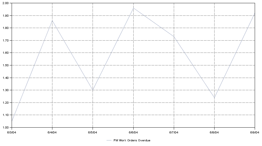
The scale is based on the KPI values so it will depend on what you are querying on in your Select statement and where clause in the KPI. It is simply a plotting of the data points collected when the KPI cron task is run (usually nightly).
It could be a percentage if you have a select statement like:
select (sum(actmatcost+actlabcost+acttoolcost) - sum(estmatcost+estlabcost+esttoolcost)) / sum(estmatcost+estlabcost+esttoolcost) * 100 from workorder
or a decimal value if your select is getting a count of workorders like the query below:
select count (*) from workorder
It should allow you to display the greatest and least values in the same view - so it scales based upon the KPI and the historic readings. If your cron task is set to run at off peak hours then the data points may not give you an accurate reflection if you are searching for time variable data such as how many sessions are being used.
The values used in your trend graph are generated when your KPI cron task is run, usually at night, so your values may be different than what you see during the day. Generating the KPI manually during the day doesn't change the values that are used in the trend - they will still come from when the cron task is run. In addition the values shown are from a single point in time and are not an average.
Was this topic helpful?
Document Information
Modified date:
13 April 2021
UID
swg21440464